JS Frontend Libraries & Frameworks

Library vs Framework

First lets explain the difference between a “Library” and a “Framework”.

Libraries are mostly “small” code bundles which allow the developer to extend the functionality of an already present application.
Examples for libraries are Moment.js, jQuery or Data-Driven Documents.

Frameworks are most of the time “bigger” and usually provide a distinct structure how data should be handled or saved. Frameworks often provide easier ways to reuse already written blocks of code and already have built in security features like XSS Protection and CSRF tokens.

Why do JS Frontend Libraries/Frameworks exist?

There are many different reasons why JS Frontend Libraries/Frameworks exist:

  • Performance
  • Complete separation between frontend and backend logic
  • New technology / developer doesn’t want to work with “old” technology

Whats the principal behind JS Frontend Libraries/Frameworks?

Lets take a typical PHP as basis:

  1. Browser requests website
  2. Web server gets request from browser and looks for the defined document root
  3. If there is a PHP file present it will be interpreted
  4. Now all Database queries are being executed which can theoretically take a lot of time
  5. The resulting HTML and connected CSS and JS will be returned to the browser

Point 4. is the important part here: The database query is executed immediately when the request is being proccessed by the web server.

Now in comparison a website built with a JS Frontend Frameworks

  1. Browser requests website
  2. Web server gets request from browser and looks for the defined document root
  3. Web server delivers HTML, CSS and JS without executing DB Queries
  4. The browser renders the HTML and CSS and interprets the JS
  5. In JS the client now executes extra AJAX requests to the web server to dynamically load the needed data.

Therefore the initial HTML is very small because usually in JS Framworks the DOM only consists of 1 “root” element in which all the virtual DOM is rendered by JS.

Main difference to PHP is the fact, that the dynamic content will be added by the client, not the server!

This has also the advantage, that the backend code to manage the dynamic code doesn’t need to worry about frontend code.

Currently popular JS Libraries/Frameworks (June 2020)

  • React
  • VueJS
  • Angular

Basically there is no “ultimate” framework which is best for all scenarios. But bellow you can see a short description of each framework so you can make your own decission.

React is a “light” Library/Framework, which only has a few basic concepts (like e.g. “Components”) to build your project. Therfore you don’t have to learn that much and the start is not that difficult.

You can also use react just as a library (see HERE), but on the example of Next.js you can see a whole framework which is built on React.

VueJS basically has the same features as React. But one main difference to React is the fact, that VueJS doesn’t built its virtual DOM with JSX. See HERE for a description of what the virtual DOM and JSX is.

Angular is a “larger” framework and therefore has much more functionality built in. Thats why its better suited for bigger projects because you can already use “finished” functionality and don’t have to build everything yourself. But understand, using and maintaining these already build code blocks can be kind of tricky especially while updating Angular.

Specificity – The priority in CSS

Lets start with the following question:

What will be the result of the following DOM?

<style>
  main p {
    color: red;
  }
  main p {
    color: green;
  }
</style>
<main>
  <p>Text 1</p>
</main>
<p>Text 2</p>

Here we have 2 same selectors but different properties.

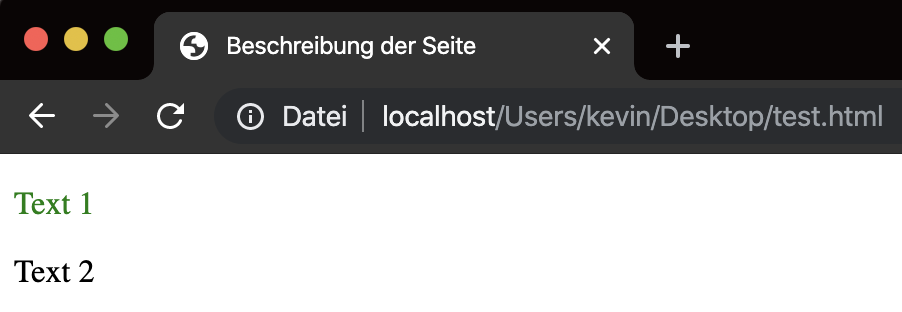
But as you can see from the screenshot only the second one is being applied, not the first one.

Reason behind that is the fact, that always the last defined properties will be applied which are present for one specific selector. No matter if the CSS is applied via an extra .css file or via inline CSS in the DOM.

Elements, Classes, IDs and inline styling

Element selectors

Element selectors do no have a prefix and therefore contain only of the HTML tags without the <>

main {
  color: red;
}
<main></main>

Class selectors

Class selectors have a prefix of . and are applied on all HTML elements with the given class attribute.

.my-class {
  color: green;
}
<div class="my-class"></div>
<main class="my-class"></div>
<p class="my-class"></p>

ID selectors

ID selectors have a prefix of # and are applied to all HTML elements with the defined ID attribute.
But I have to mention that – due to the HTML specification – there should only be one elements with a specific unique ID!

#my-id {
  color: teal;
}
<div id="my-id"></div>

The priority

Now the important part: When does one selector rule over another?

As we already mention only the last defined properties of a selector are applied. But what if we have no other way to just include our CSS in the middle of 2 other selectors?

Problem

<style>
  p {
    color: red;
  }
  <!-- PLUGIN CSS START -->
  p {
    color: green;
  }
  <!-- PLUGIN CSS END -->
</style>
<main>
  <p>Text 1</p>
</main>

As you can see in the HTML comments this example tries to show what can happen if CSS is added to your webpage at the very end of the <head> area. But we want to have red text, not green.

Solution

Increase the “specificity” of our selector.

<style>
  main p {
    color: red;
  }
  <!-- PLUGIN CSS START -->
  p {
    color: green;
  }
  <!-- PLUGIN CSS END -->
</style>
<main>
  <p>Text 1</p>
</main>

How does this work?

The browser gives each selector a “ranking” so it can decide which selectors should be applied.

This ranking is built up with this system:

Here are some examples:

SelektorSpecificity
p0001
main p0002
.active a0011
#menu .active0110
ul#menu li.active a0113
body.ie11 .col-3 h20022

The evil !important

You “can” add a !important to each property inside a selector to “force” your property.

.my-class {
  color: red !important;
}

#my-id {
  color: green;
}
<div class="my-class" id="my-id"></div>

The !important increases “specificity” of your property by 10000 (like adding another column at the very beginning of the image) and therefore the <div> will be shown in red instead of green.

The main problem here is the fact, that its pretty hard to extend after that adjustment.

Best Practises for specificity

Basically you should keep your “specificity” as low as possible.

Therefore you should mainly use element and class selectors and avout ID selectors, inline style sttribute and !important.

A very popular approach is e.g. the BEM model to create an extensible class based structure.

Source: https://css-tricks.com/specifics-on-css-specificity/

CSS – Styling for HTML

Cascading Style Sheets are responsible for the “Look&Feel” of a website.

How does CSS work?

Lets take the following HTML as basis:

<!doctype html>
<html lang="de">
  <head>
    <meta name="viewport" content="width=device-width, initial-scale=1.0" />
    <title>Beschreibung der Seite</title>
    <style>
        p {
          color: red;
        }
    </style>
  </head>
  <body>
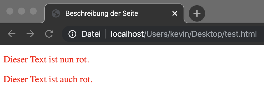
    <p>Dieser Text ist nun rot.</p>
    <p>Dieser Text ist auch rot.</p>
  </body>
</html>

So we have 2 paragraphs in the <body> which will be styled red via the CSS placed in the <head>.

With this example we can see, that CSS works on multiple elements, not only the first element.

What are selectors and properties?

Selectors are “paths” which define when a specific rule should be executed on an element.
Properties are the styling changes which should happen on the defined elements.

Example1

p {
  color: red;
}

p is the selector and defines, that all paragraphs (<p>) should get the following styling.
color: red; is the property which will be applied to the element.

Therefore all <p> elements in the DOM will get a red text color.

Example 2

main > p {
  color: red;
}

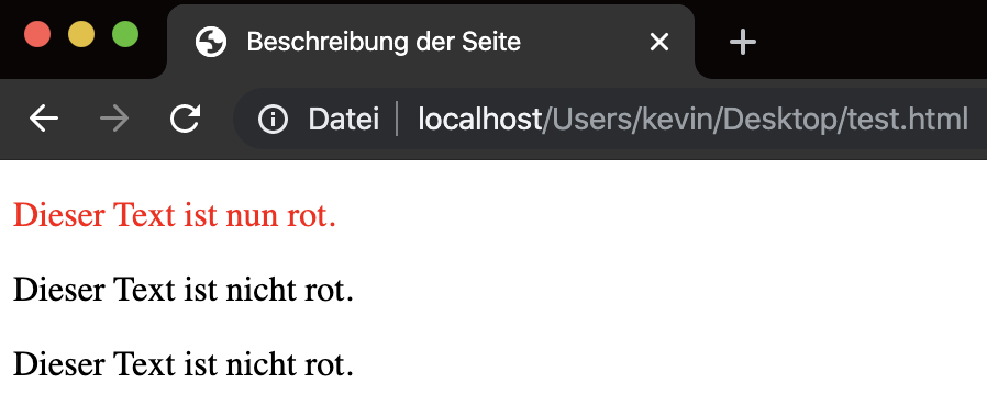
In this example only paragraphs get a red color, which are positioned directly after a <main> element.

Here an example:

<!doctype html>
<html lang="de">
<head>
  <meta name="viewport" content="width=device-width, initial-scale=1.0" />
  <title>Beschreibung der Seite</title>
  <style>
    main > p {
      color: red;
    }
  </style>
</head>
<body>
<main>
  <p>Dieser Text ist nun rot.</p>
  <div>
    <p>Dieser Text ist nicht rot.</p>
  </div>
</main>
<p>Dieser Text ist nicht rot.</p>
</body>
</html>

Example3

main p {
  color: red;
}

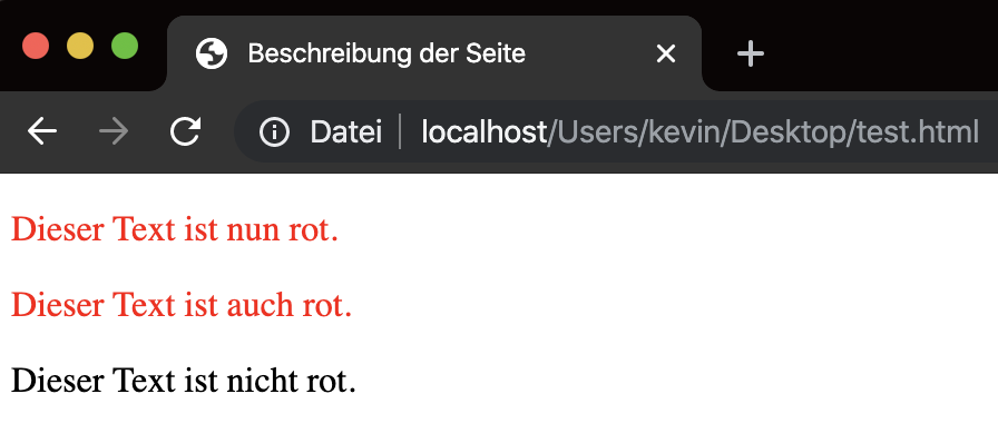
This example looks nearly identical to example 2, but the > between main and p is missing.

This causes, that all <p> inside a <main> element will get a red text color no mater how “deep” the <p> is nested inside the <main>.

<!doctype html>
<html lang="de">
<head>
  <meta name="viewport" content="width=device-width, initial-scale=1.0"/>
  <title>Beschreibung der Seite</title>
  <style>
    main p {
      color: red;
    }
  </style>
</head>
<body>
<main>
  <p>Dieser Text ist nun rot.</p>
  <div>
    <div>
      <div>
        <div>
          <p>Dieser Text ist auch rot.</p>
        </div>
      </div>
    </div>
  </div>
</main>
<p>Dieser Text ist nicht rot.</p>
</body>
</html>

Which types of selectors are there?

There are 3 main types of selectors:

  • Element selectors like main only work on HTML tags <main>
  • Class selectors like .my-class only work on any elements which have class="my-class"
  • ID selectors like #my-id only work on elements which have id="my-id"

There is a more detailed explenation in the post Specificity – The priority in CSS.

How can I connect multiple selectors – aka “Combinators”?

As already seen in the above examples you can combine selectors to achieve different “matches” in your DOM.

  • main > p
    • Here all p elements will be selected which have a direct main parent
  • main + p
    • Here ONLY 1 p element will be selected which is parallel to a main element AND is placed AFTER the main element.
  • main ~ p
    • Here ALL p elements will be selected which are parallel to a main element AND is placed AFTER the main element.
  • main p
    • Here all p elemente inside a main element will be selected no mater how “deep” the p is nested inside the main element.

See https://www.w3schools.com/css/css_combinators.asp for more examples

How do I embed a CSS file?

Typically a CSS should be placed inside the <head> area like that:

<link rel="stylesheet" type="text/css" href="style.css" />

With this example the style.css file is positioned parallel to the index.html in the file system.

But as you have already seen in the above example you can write “inline” CSS with the following tag (no mater if its placed in the <head> or <body>)

<style>
  ...
</style>

The Viewport – Window of the browser

As already mentioned in HTML – The structure of website the viewport is reponsible for how a website is presented to the current device.

What is the viewport?

The viewport is the area, which is visible for the user opening your website on a specific device.

This viewport can be different per device due to the fact, that devices can have different display sizes and/or resolutions.

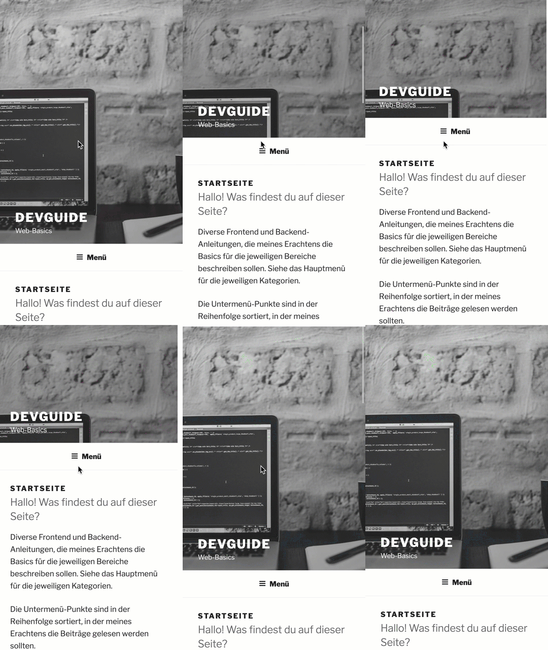
Here you can see the website devguide.at with an viewport meta tag as a mobile device:

And here without an viewport meta tag

How do you add/adjust the viewport?

The following meta tag needs to be placed inside the <head> area of your HTML:

<meta name="viewport" content="width=device-width, initial-scale=1.0">

HTML – The structure of websites

The Hypertext Markup Language (short HTML) is a text based language which is usually used to build up the structure for a webpage.

HTML is NOT a programming language due to the fact, that you can’t implement processes or logic with HTML.

Sime exampe for a HTML file

<!doctype html>
<html lang="de">
  <head>
    <meta name="viewport" content="width=device-width, initial-scale=1.0" />
    <title>Title of the page</title>
  </head>
  <body>
    <p>This text will be displayed in the browser.</p>
  </body>
</html>

What did we define here?

  • <!doctype html>
    • It is a HTML 5 file
  • <html lang="en">
    • Start of the html area and define the language of the page
  • <head>
    • Start of the head area of the website
  • <meta name="viewport" content="width=device-width, initial-scale=1.0">
    • The viewport of the webpage adjusts itself to the size of the clients device
    • To learn more about what the Viewport is look HERE.
  • <title>Title of the page</title>
    • This will be shown in the tab of the browser
  • </head>
    • End of the head area
  • <body>
    • Start of the body area
  • <p>This text will be displayed in the browser.</p>
    • Display a “paragraph” with the given text inside it
  • </body>
    • End of the body area
  • </html>
    • End of the html area

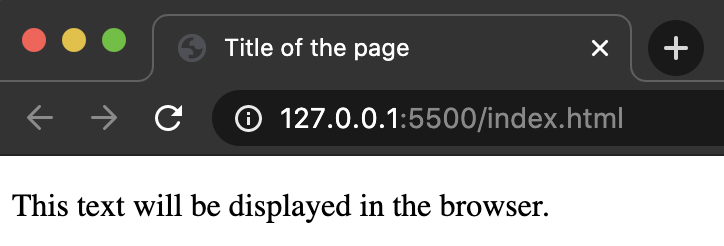
Result

What are HTML-tags?

Basically a webpage consists of HTML tags, which most of the time always have a start- and an end-tag: <tag></tag>

Examples:

  • <html></html>
  • <head></head>
  • <body></body>
  • <p></p>

Each “tag” has a special functionality. The most important HTML-tags can be looked up here: https://www.w3schools.com/tags/ref_byfunc.asp

But there are some exceptions which do not require an End-tag. Examples:

  • <meta />
  • <img />
  • <input />
  • <br />
  • <hr />

What are attributes?

Attributes are additional information that can be stores inside an HTML-tag:

Examples:

  • href in <a> Tags
  • src in <img> Tags
  • type in <input> Tags

These attributes are very dependent on each HTML-tag itself. Some of these attributes are required while others can be optional.

Universal attributes can be added to all HTML-tags. These are:

  • class
  • id
  • style
  • tabindex

class, id and style are primarily used for styling, see Specificity – The priority in CSS for more information.

Of course there are more “globally” used attributes:
https://www.w3schools.com/tags/ref_standardattributes.asp

What is the DOM?

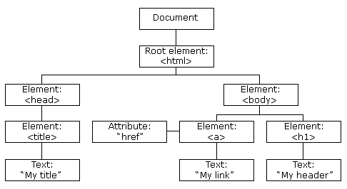
The Document Object Model (short DOM) is the tree structure which results from the given HTML-tags.

Here is a nice visualisation from W3Schools:

This “Document” object can also be accessed via JavaScript to adjust the given DOM or perform check on it.

If you have an invalid DOM (e.g. a <div> is opened but never closed with a </div>) the browser usually tries to compensate or adjust accordingly but if you have to many errors in your DOM you will have very strange errors or problems on your webpage.

Thats why you should regularly check your DOM with the W3C Validator (https://validator.w3.org/) and fix at least the errors, if not also the warnings.